ATTACK ON TITAN
Attack on Titan is a Japanese dark fantasy series based off of the manga by Hajime Isayama. Since it first aired in 2013, it has become one of the most popular anime series of all time, receiving widespread critical acclaim and praise from an audience of millions worldwide. Heading into its final season, Funimation was tasked with reigniting excitement for the latest and last installment of the series–as well as bringing newcomers in to catch up on the show and join the ride to the end.
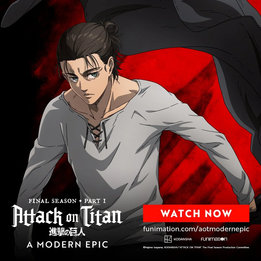
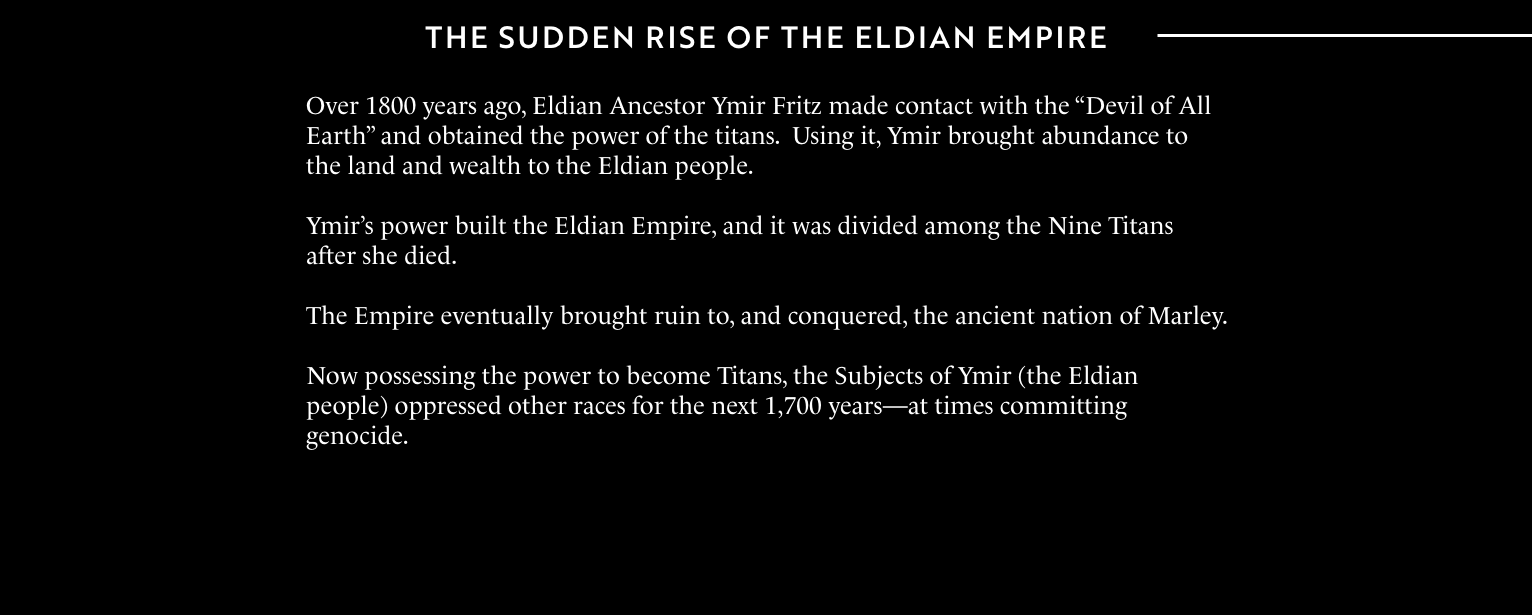
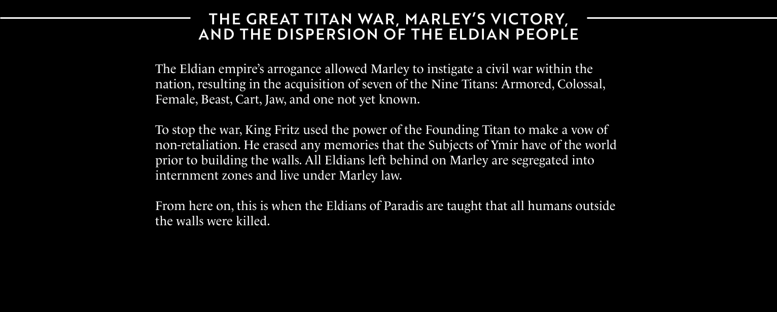
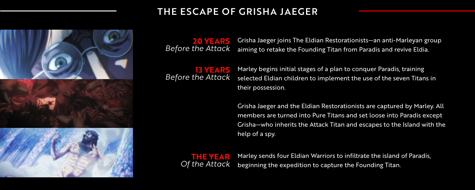
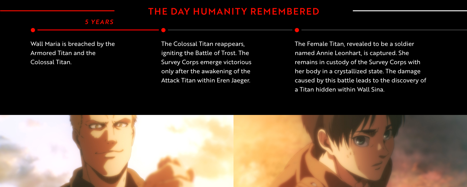
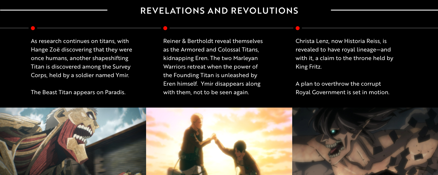
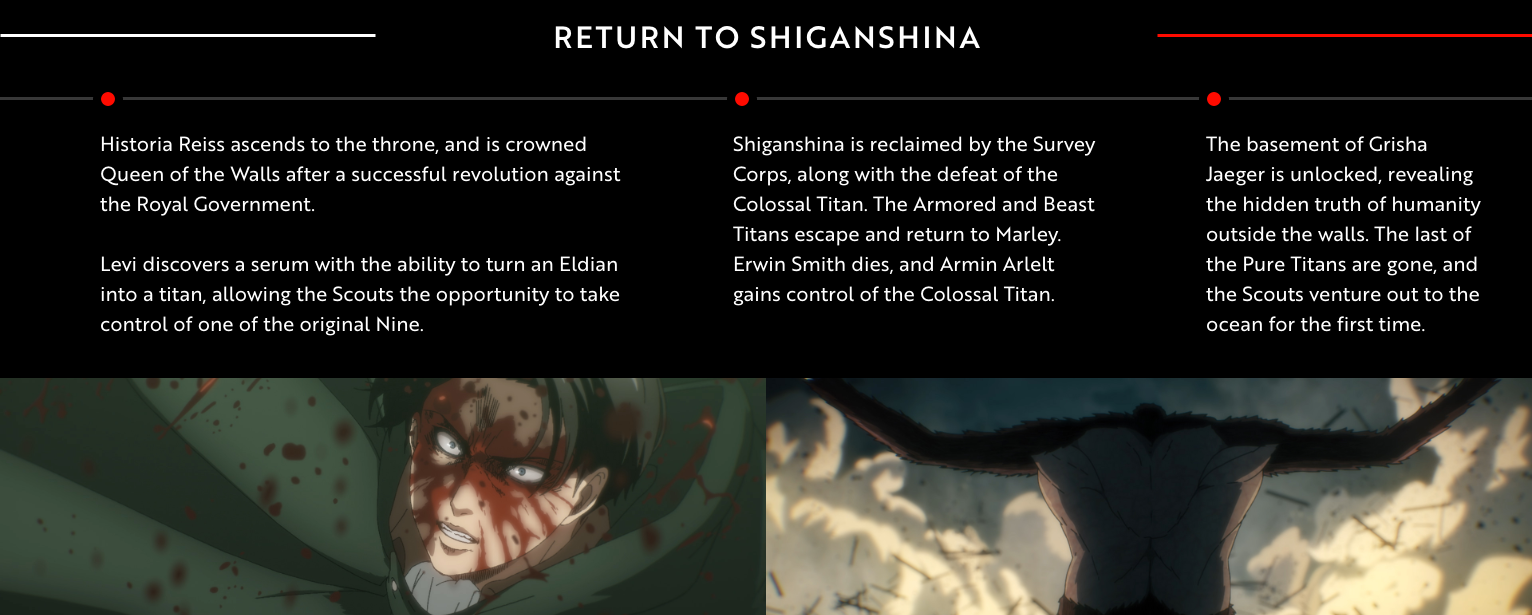
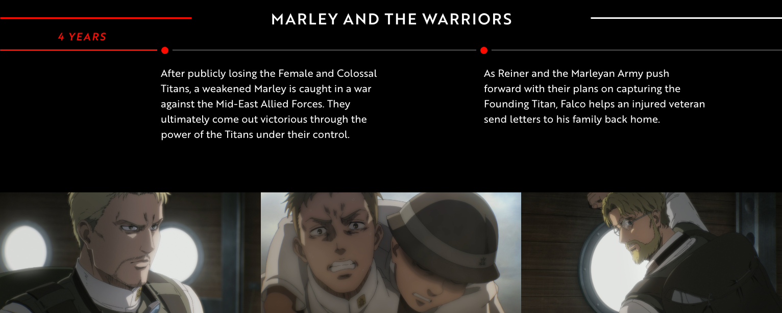
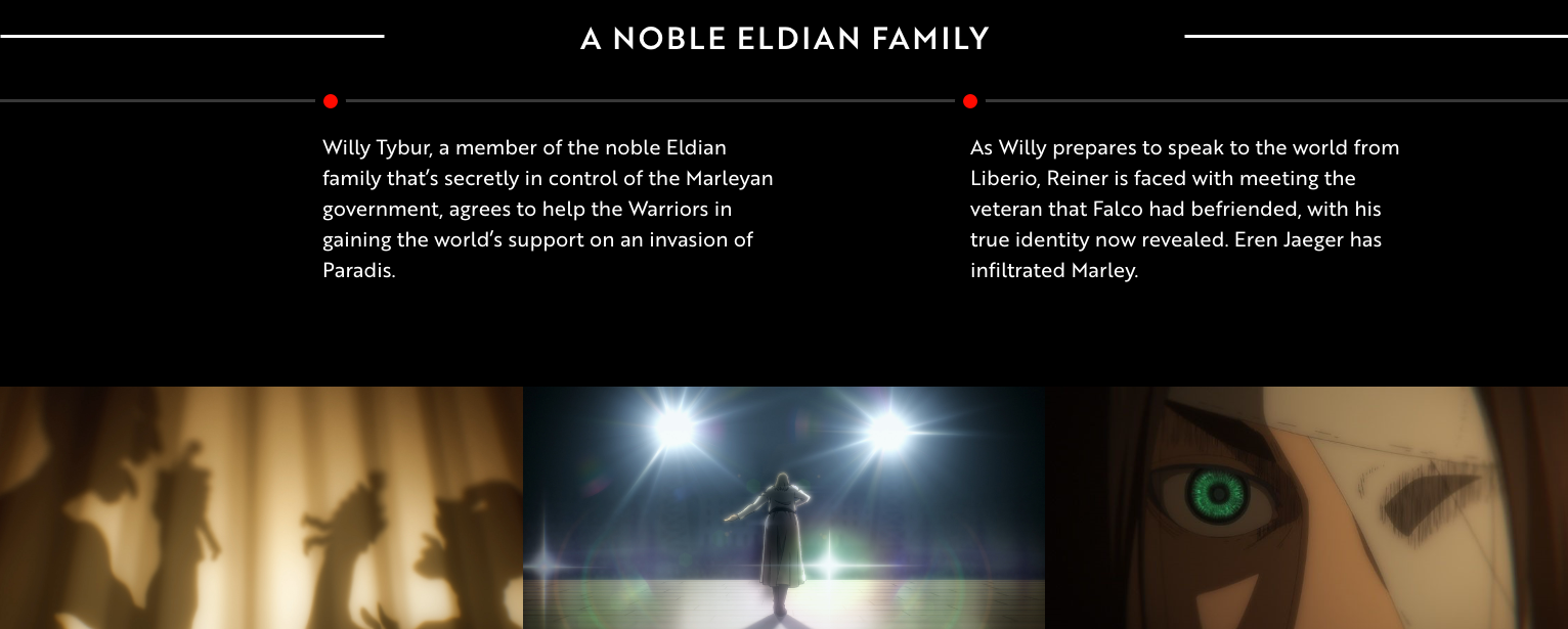
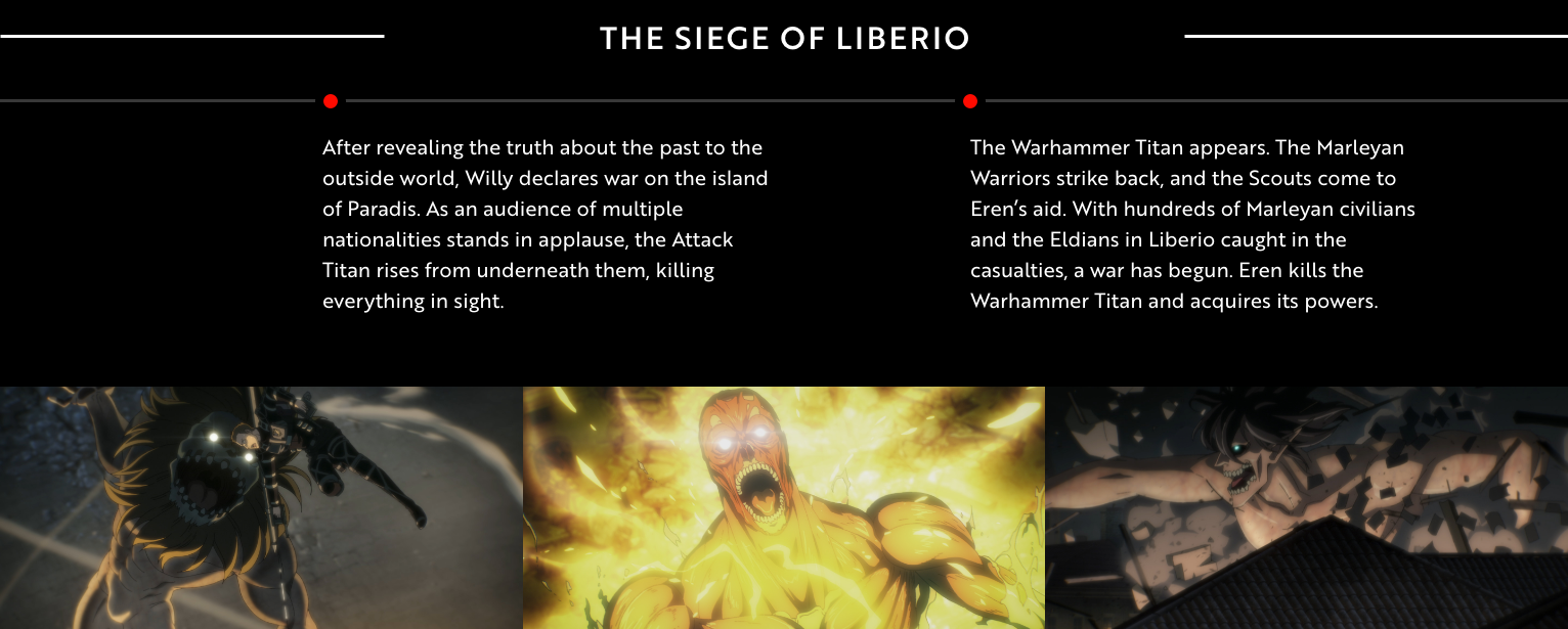
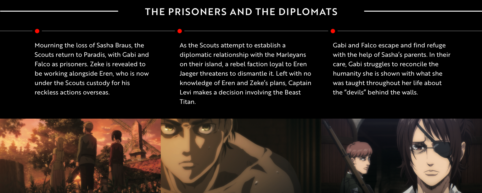
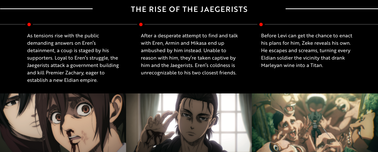
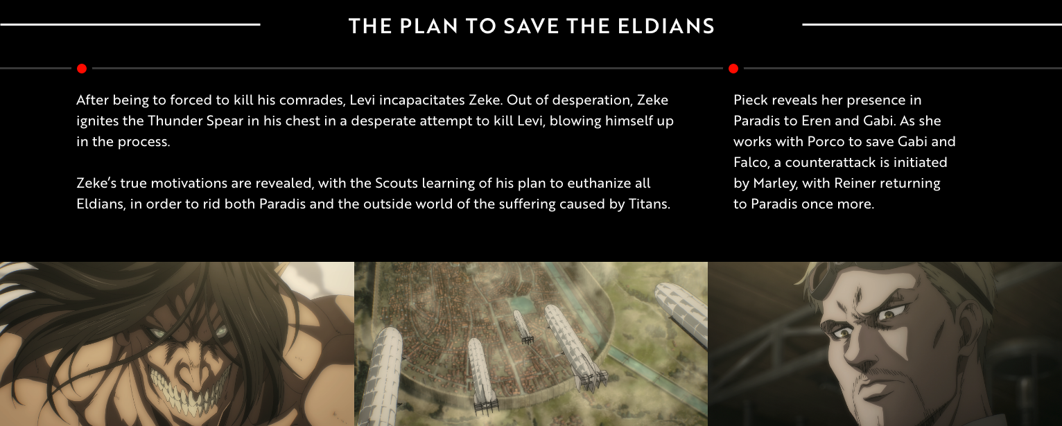
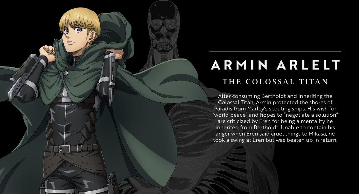
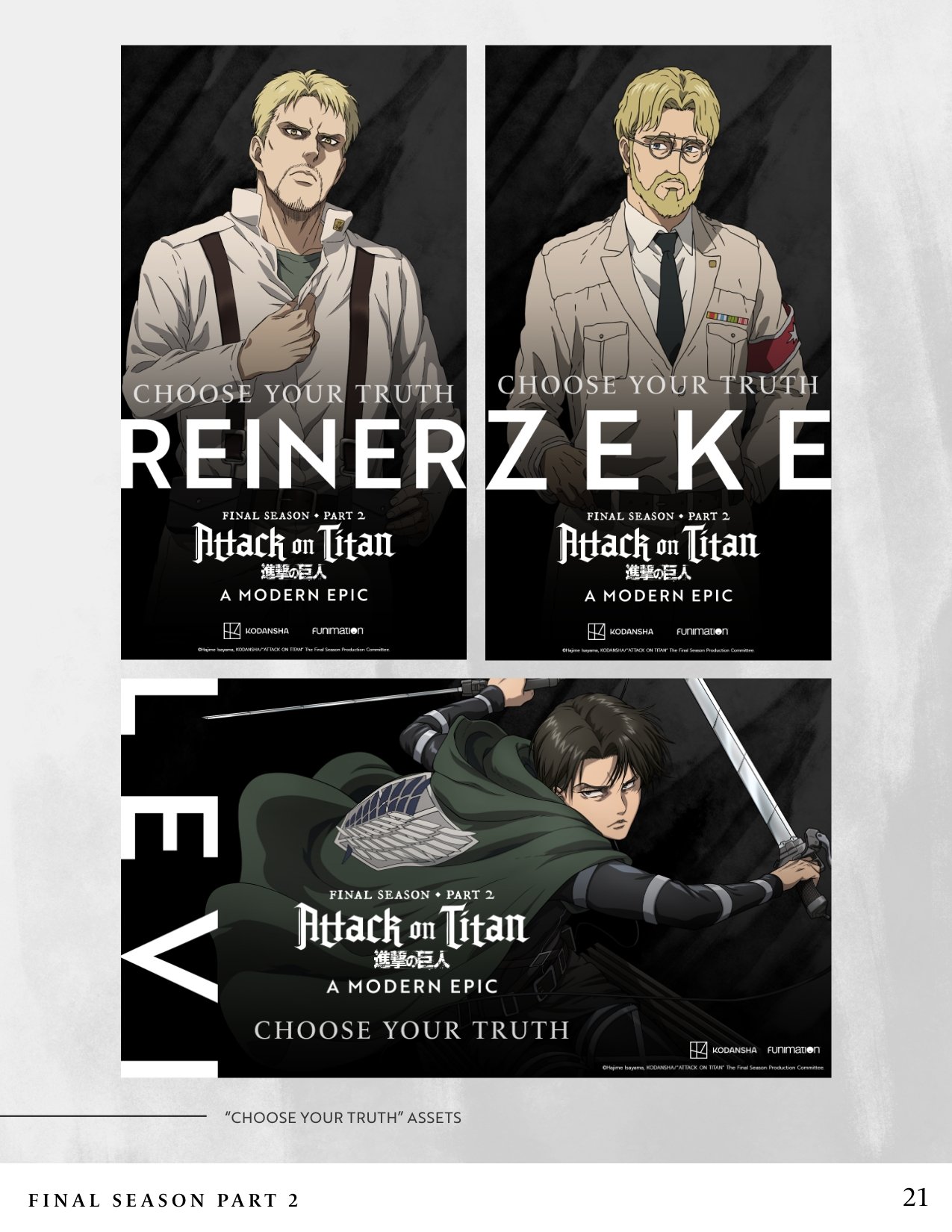
The campaign, titled “Attack on Titan: A Modern Epic”, was the culmination of our efforts in marketing the final season of the show, along with bringing attention to the previous three seasons. My work focused mainly on establishing the style guide, and applying those guidelines to the assets I created for the show’s webpage on Funimation.com. These assets include character bios, downloadables, paid media, and a timeline showcasing the show’s story so far.
Approaching this project as a fan of the series (I’m really understating the word “fan” here), my choices for the campaign’s visual style were heavily driven by my attachment to the show’s story and its characters. Attack on Titan has an incredibly dark setting; its world is unforgiving, and the only way many of the characters in its story are able to move forward in that world is by being relentless to their core. They can be driven by love, by hope, or by rage–but the one constant is that that drive is always relentless. That’s where the primary color for this campaign’s visuals came from, and it’s probably the first decision I made when I started this project.
For typography, previous campaigns were marketed mainly using serif fonts which reflected the more old-world visual style of the series itself. This was changed for the “Modern Epic” campaign–with a serif font (Brother 1816) being the primary choice for headers, body text, and call-to-action buttons; it was also partly inspired by the desire to direct the attention mainly towards the artwork of the show itself.
Info
Work:
VISUAL Design
BrandING GUIDELINES
ANIMATION
copywriting
Logo + Typography
Timeline:
Part 1: 2 months (2020)
Part 2: 2 Months (2021)
Collaborators:
Jennie Kim
Jing Wei
ONE UNIVERSAL ELEMENT
Keeping a minimal visual identity was important not only to maintain a focus on the visuals of the show itself, but because this campaign would also require designs for a wide range of differently-sized assets. Whatever assets our team worked on for the show had to have a design language that worked in both large and small variations. To achieve that, I created a background texture that could serve as an appropriate background detail for the visual flow of any given asset. The goal was versatility: the texture was large and detailed enough to be rotated, resized, and positioned freely by our team’s designers, and it could be used accordingly in three different color themes.


